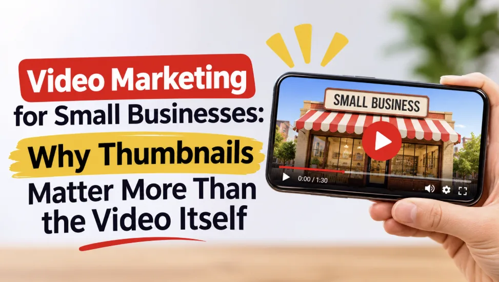
Video Marketing for Small Businesses: Why Thumbnails Matter More Than the Video Itself
A small business owner spends a day filming a helpful video. She edits it, uploads it and waits. 1 week later, video only get 12 views. The video isn’t the issue. The thumbnail is, because on a busy feed, the thumbnail is the entire pitch. People aren’t clicking pitches they can’t understand in a second.
A thumbnail gets about a second to turn a scroller into a viewer. They achieve this when the subject is clear and/or when the words are big. They’re not achieving this when the subject is cluttered or when the text is too small. The best part is, small businesses don’t need a big budget to get this. They need a clear subject, big words and the habit of testing what works.
Why the Thumbnail Decides the Click
Of course, thumbnails have to earn clicks, but they do judge so well. Because aside from the length of a title, a thumbnail is the only part of the video a user sees before they watch it. On every single location a video is shown, YouTube shows the thumbnail and title. An AI thumbnail generator online can turn a short brief into several ready concepts to choose from, each built to win that one-second judgment.
This is what best-performing videos have in common, not a promise of 90% more views. The thumbnail decides the click because it is the only part of the video a viewer judges before watching. YouTube shows it next to the title everywhere a video appears, and the viewer chooses in a second or less. Vevo proved it in 2019: a thumbnail refresh across about 4,000 music videos brought roughly a 12 percent lift in twenty days. For a small business, the point is simple: the thumbnail is the cheapest part of the job.
A Faster Way to Make Thumbnails Without a Designer
Most of the time, people will start a new design project with a blank canvas, but when it comes to generating thumbnails, people typically start with the video footage. You will want to find the strongest frame, come up with a brief, clear text element, and keep your subject large in the frame. You can get used to doing this in a short amount of time. There are AI tools that can help you with the rest.
There are multiple options in CapCut for stylistic looks. Some examples include cinematic and energetic, clean and playful, and documentary, luxurious and colorful. There are a number of different options to try out for the same idea. CapCut generates drafts, and you will want to test out the text element at phone size. No tool can tell you for sure if your thumbnail is representing your idea.
What Makes a Thumbnail Get the Click
A good thumbnail captures three elements at the same time: it shows one clear subject, says one short phrase, and stands out from the feed. Everything else is extra.
Faces and Emotion
Of all the items at a thumbnail’s disposal, an expressive face is the fastest and easiest for people to read. There are creator tools that quote a 20 to 30 percent click-through rate increase with expressive faces.
Text: Big Letters, Few Words
A good thumbnail has three to five words, and they should add to or enhance the video’s title, not repeat it. Using a type smaller than phone size becomes illegible and turns into ‘noise’. Designs should be created at 210 pixels and viewed from a reasonable distance to evaluate readability. If the subject and the text still read clearly from that distance, they will be legible to the audience.
Color and Contrast
High contrast is what makes a subject separate from a busy feed. A bright subject on a dark background, or a dark subject on a bright one, pops at a glance. Keep the important parts away from the bottom-right corner, where YouTube puts the duration stamp, or the stamp will cover the very thing you wanted viewers to see.
The Mistakes That Kill Clicks
There are a handful of mistakes that people tend to make when it comes to creating thumbnails. For instance, a lot of people will use the auto generated frames by YouTube, and a lot of the time these random stills will not be the strongest moments of the video. People will be much better off creating their own custom thumbnails.
The other mistake that people commonly make is making their thumbnails too busy. This will likely happen when people try to include way too much information in their thumbnails. These will often be illegible when people view them at phone size.
One Thumbnail Does Not Fit Every Platform
There are differing cropping standards for each social platform, which means that often, one thumbnail will not work across the board. For YouTube, which uses a 16:9 frame, your thumbnail safe size should be 1280 x 720, with a minimum width of 640. It is saved as a JPG or PNG, and the size limit is 2MB on mobile and up to 50MB on desktop. The old rule of thumb of a 2MB flat limit no longer applies.
Shorts, Reels, and TikTok are all vertical, 9:16 frames. Wide thumbnails are cropped down, and the subject at the edges gets lost. A better solution would be to find a frame with the subject centered. Facebook, as well as other sites that embed your video, typically use your thumbnail as well. So, large, centered text, and a large, centered subject should be used so it is legible and large wherever it is displayed.
Test, Measure, Improve
The best way to know what works for a thumbnail is to test it. You can find Impressions and Click-Through rate for thumbnails in YouTube studio, and for most channels, normal rates are between 4-6%. Keep in mind, the rate falls as the video reaches more people, so compare rates for videos of the same nature.
You can also use YouTube's own Test and Compare for thumbnails, which lets you test up to three thumbnails for the same video. After 14 days, the one with the highest watch time, not click, share is declared the winner.
A Simple Weekly Routine for a One-Person Team
A small team needs a routine, not a burst of effort, and thirty minutes a week is enough.
Pick the Video's One Promise Before Filming
Grab Two to Three Strong Frames While Editing
Create Two Thumbnails in the Same Sitting
Upload, Then Check the Click-Through Rate After a Week
Save the winning layout as a reusable template.
Do that every week and the channel builds a look of its own. The thumbnails get better because each one learns from the last.
Conclusion
A thumbnail is a small business's storefront on a video feed. It costs little, it takes minutes, and it decides whether the work inside the video ever gets seen. The businesses that win the click are not the ones with the biggest budgets. They treat the thumbnail as part of the video, not as an afterthought. Start with one video. Make a custom thumbnail, keep the text short, test a second version, and keep the winner. Clicks follow thumbnails that respect the viewer's time.